Article by Featured Author
Posted December 2019Today’s lawyers are learning to create legal writing that doesn’t sound — or necessarily look — like it was written by a lawyer. Legal writers are making a conscious effort to write prose that a judge (and most importantly, a judge’s clerks) will want to read. And they are becoming more proficient at designing documents that look less like legal documents and more like the books and web pages that we routinely read.
Legal writers are concerned not only with the words they use in appellate briefs but also the design of the documents themselves. While appellate briefs must often conform to strict jurisdictional requirements, it is possible to increase a document’s readability in subtle ways. In fact, doing so indicates to the court the lawyer’s respect for the judge’s time limitations.
Many legal writing scholars — including Bryan A. Garner, Ross Guberman, and Matthew Butterick — regularly emphasize in their books and articles the importance of modern lawyers becoming proficient in document design. This short article focuses on one tool that lawyers may use to increase the readability of their briefs: fonts.
“Bah,” a attorney-friend balked when I suggested that many courts are recommending and requiring fonts other than Times New Roman. “But Times New Roman is standard,” he replied. At best, it is a standard bad habit.
According to Matthew Butterick, “[o]bjectively, there’s nothing wrong with Times New Roman. It was designed for a newspaper, so it’s a bit narrower than most text fonts.” 2 The use of Times New Roman, however, suggests indifference. It was designed in 1929 for the Times of London and became the standard font of both Mac and Windows in the ‘80’s and ‘90’s. 3 But, it “is not a font choice so much as the absence of a font choice, like the blackness of deep space is not a color. To look at Times New Roman is to gaze into the void.” 4 Butterick implores: “If you have a choice about using Times New Roman, please stop.” 5
Butterick is not alone in his distaste for Times New Roman. The Seventh Circuit also suggests avoiding Times New Roman: “Briefs are like books rather than newspapers.” 6
Times New Roman was designed for readers of newspapers, not for readers of complicated legal documents. 7 Parsing legal documents requires careful attention, while newspapers are designed to be scanned. 8 As such, the typeface in briefs should be set with the goal of enhanced — not lessened — readability. 9 The Seventh Circuit suggests that lawyers “read some good books and try to make your briefs [look] more like them… [M]aking your briefs typographically superior won’t make your arguments better, but it will ensure that the judges grasp and retain your points with less struggle.” 10
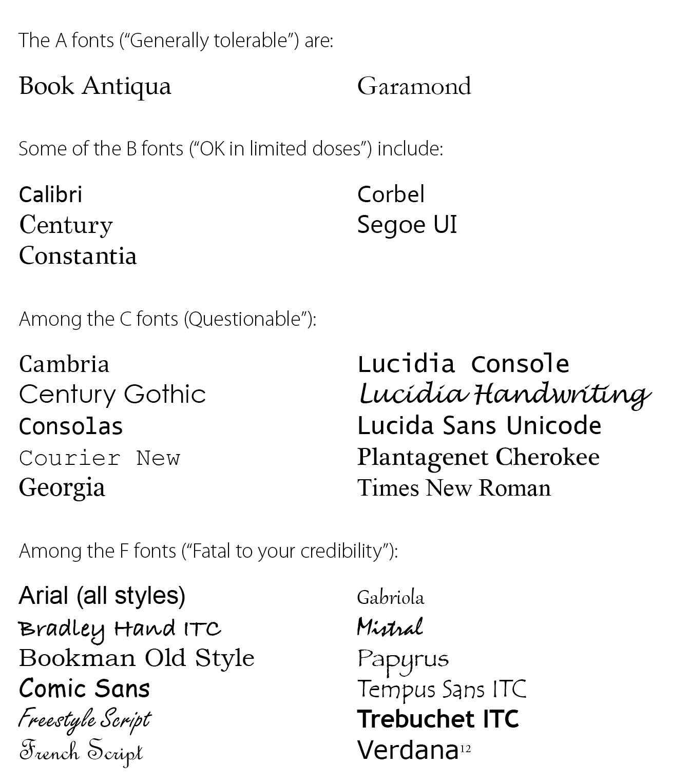
So what fonts should be used to make briefs more readable? Butterick provides a chart of fonts graded from A to F. (See list on right.) Many of the suggested fonts do not exist in the list of standard system fonts on Microsoft Office 2007. 11
The judges of the Seventh Circuit have given considerable thought about how to make a brief look good — and “thus more likely to be grasped and retained.” 13 Here are some of the court’s recommendations: